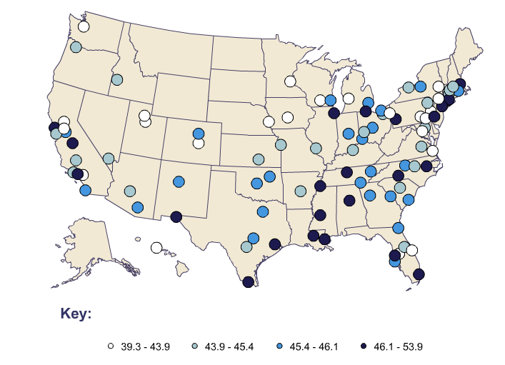
(Johana C.) This graph is describing the income inequality between people. The dark circles are the cities with the most difference. It goes down by darkest to lightest. The lightest one is the one with the least difference between income. It shows that more developed cities have a larger gap between income. As you can see, this graph only shows the main cities in the United States.
The dark blue one is the highest difference and it goes down from there.
American Community Survey. (2010). Income Inequality -- Gini Index. Retrieved April 24, 2017 from http://www.diversitydata.org
The dark blue one is the highest difference and it goes down from there.
American Community Survey. (2010). Income Inequality -- Gini Index. Retrieved April 24, 2017 from http://www.diversitydata.org
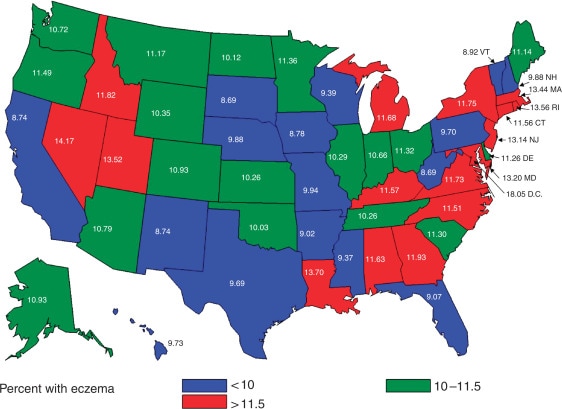
(D.M.) This graph shows the AD prevalence in industrialized countries that are derived from the study of European populations. The objective of this study was to determine the prevalence of Atopic Dermatitis in the United States using data obtained from the National Survey of Children's Health (NSCH).
http://www.sciencedirect.com/science/article/pii/S0022202X15350132
http://www.sciencedirect.com/science/article/pii/S0022202X15350132
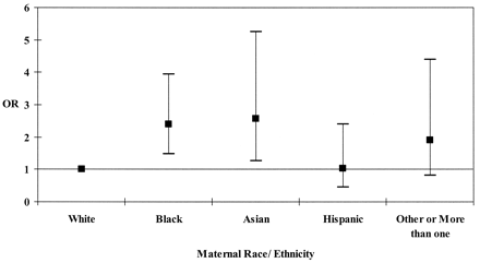
This Graph represents the inequity between Eczema and Ethnicity. The dark shaded square represents the median/ range of people affected by Eczema. Research has proven that male African Americans and male Asians is more frequently to develop Eczema in their life span. -Kiera
